A sample of my VFX work. Made using Maya, After Effects, Boujou and several other tools (including Flash). My passion here is dynamics. I love organic movement.
Autodesk Educational VFX Package
I am one of those strange people who was able to teach themselves Maya and ZBrush. It can be done, but it is not easy (admittedly, ZBrush was FAR easier to learn than Maya, but that's beside the point). That being said, if you are a student (or an employee or affiliate of an educational institution) and would like to learn about 3D modeling, animation and/or video compositing Autodesk has a GREAT deal going on right now: For $200, you can get a 14-month educational license of Maya 2009. But that's not all! Act now (actually, I think this deal will be around for a while, so don't impulsively blow money) and you will also receive: Mudbox (a 3D digital sculpting program that is awesome), Toxik (a node-based compositing program that is awesome), Motion Builder (a 3D character animation program that is awesome) and Cleaner XL (which comes with Autodesk everything, whether you want it or not)! If you weren't able to gather from this paragraph, this is awesome! Several months ago, it would have cost me more than $300 just to upgrade to Maya 2008. With the exception of Motion Builder, I have other software that will do much of what these other programs do. This deal, however, might be too good to pass up.
My favorite place to get educational software is Torcomp. You can find this deal on other sites such as Academic Superstore. The license is a few dollars cheaper and a couple months longer at Torcomp/Studica...
http://www.torcomp.com/products/product_detail.cfm?productid=57961
If you're not a student, I'm not sure if there is a bundle like this. I honestly haven't looked into it because I'm not yet really making money on any of this software so I have no need to have a full license. Some day, though. Some day...
ch-ch-ch-changes!
I'm giving The Cutting Room Floor a much-needed makeover. While the "Darkwater" theme that comes as a plugin with WordPress was very nice, I didn't really think that it visually represented me as accurately as it could. I feel that this new imagery does a much better job. The background image is something I made in Maya. I took great care to be as accurate as I could. I measured out a typical piece of 35mm film, complete with Dolby, SDDS and optical soundtracks, accurately measured out the sprocket holes, aspect ratio, etc. For the texturing (which involves the colors, images, and actual "texture"), I made as detailed a reproduction as I could in Photoshop and then applied it to my filmstrips. I then mapped the color channel into the transparency channel and set a slight bump map to accurately portray the ridges of the film emulsion. I rendered the whole thing with mental ray. That was a whole lot of technical! If you understood it, cool. If not, just check out the images and marvel at their accuracy and coolness. :) I've been working on it for a while and just got the time to render it recently. Below- the Photoshop reference image :
Compare that to this image from wikipedia. The most interesting part to make was the soundtrack. The "static" shapes between the sprocket holes contains the information for the Dolby Digital soundtrack (see the little "DD" symbol? that's really there!), the two blueish strips of "noise" on the edges contain the information for the SDDS track and the black and white sine wave patterns are the optical soundtrack, read by a lightbulb in the projector.
Pretty cool, eh? I stuck some countdown leader in the middle of the frames and then deformed the strips and added some cool glowey light and some metallic sphere thingies in a sort of "orbit" around the light (just going back to the astronomy interests). I'd love to hear feedback on it- especially if you find it detrimental to the blog reading experience. I tried to be kind to the eyes and I'm still working on the page layout...
Day Two- Kung Fu and 3D Love
The day started with me attempting to get some work done in the American Pavilion, or AmPav as the folks in the know call it. It’s difficult to write when people sit down next to you and start chatting, but it can be worth the frustration. One person offered me a job… here. He wanted me to do some animation for him on the film he is screening in the market next week. The thought of stopping all festival activities to do AfterEffects work does not sound appealing to me. I’ve politely declined. A couple of times... I sat in on an AmPav panel discussion about 3D. I don’t mean 3D animation, but actual 3D where you wear the glasses.
3D Panel - Awesome
I must admit, I am a convert. After realizing how doable 3D is these days, I began seeing my whole film in 3D and it was pretty exciting. I'm seriously considering going down that road. The guest celebrity speaker here was James (Jim) Cameron- participating via Skype. I read part of a recent article he had written in a video magazine, so I knew that he was intimately familiar with the technology he is using, but I was still impressed. He spoke briefly about "Avatar," which I really can’t wait to see, but spoke more about industry trends and technological possibilities. He's passionate about what he does. It was inspiring and contagious. He was "there" with his DP and basic... genius guy, Vince Pace.
James Cameron and Vince Pace talk about 3D
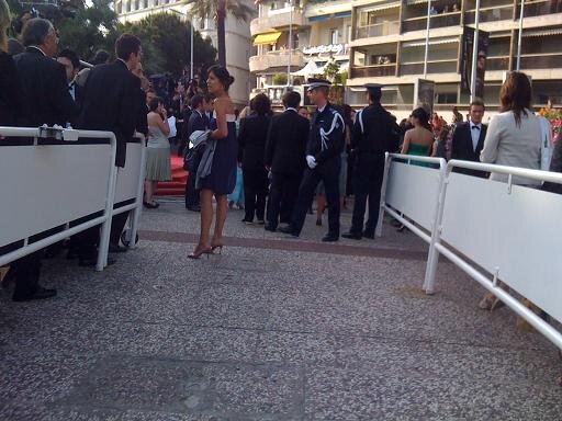
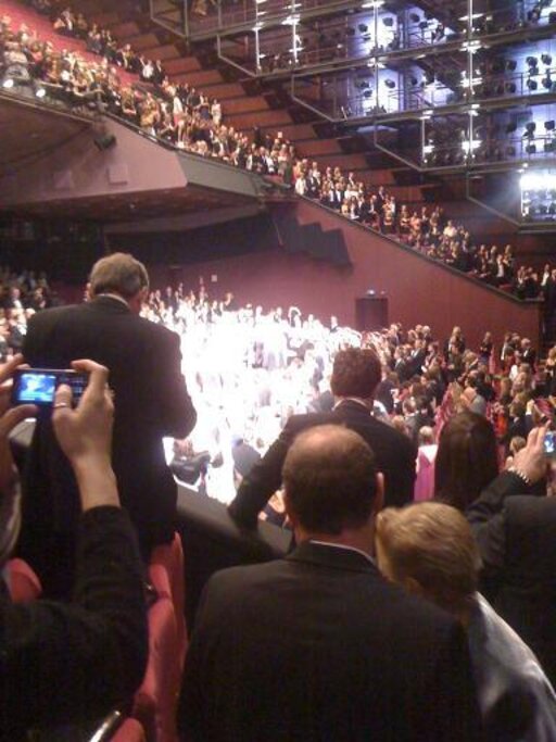
Then, it was the red carpet premiere of Kung Fu Panda! I have to admit, it wasn't number one on my list, but it stars Jack Black and Angelina Jolie, who were kind enough to pose for me the last time they were in an animated film together and in Cannes (my pictures from 2004- Angelina Jolie, Jack Black and Will Smith on an inflatable shark). Plus, it was an animated film about Kung Fu. How could I not see it? Now that I have chilled in the same "room" as them and watched a movie, I think that officially makes us "friends." George Lucas and Dustin Hoffman and Lucy Liu and countless others were also in the audience. I didn't get many pictures of the stars (yes, Sue, Brad Pitt was there), but if you've ever wondered what it's like on the other side of the paparazzi cam, here's a bit of a photo rundown:
Almost there
Approaching the tapis rouge:
Red carpet, baby!
J'y arrive!
The guards and the paparazzi
on the other side of the lens:
Walking up the steps
and up the steps I go:
The steps (les marches rouges)
Looking back at the crowd
Me- red carpet in the background! Thanks to the english women who took my photo!
my outfit (I got this for the screening of LOOP because of the cranes printed on it, but I thought it was appropriate for Kung Fu Panda because... well... Kung Fu! Crane style is one of my favorite styles:
Detail on my dress.
Inside the theater- balcony
The stars really glow!
You know, I've made jokes about the two types of stars that I like, but I thought it was funny to see just how brightly they glow:.
My phone doesn't zoom, so I had to take a picture of the screen:
Jack and Angie- my buds
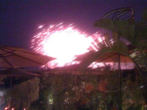
Fireworks on the croisette (the main street of Cannes):
Fireworks on the Croisette
Fireworks from the rooftop poolside party.
I decided to do a crane-style pose in my crane-style dress in honor of Kung Fu Panda:
Black tie crane
You can see from the photo that I'm carrying my trusty fish purse- my festival favorite. I was photographed twice by some fashion magazines because of it.
The film was okay, by the way. Nothing new for anyone familiar with Kung Fu movies/stories. I thought the idea of having animal characters for each animal style was pretty cute. For the most part, the animals seemed to behave true to their style. I liked it a lot, but it was definitely not a "phenomenal" film. Part of me wondered why Lucy Liu and Jackie Chan were even cast- they spoke all of three lines.


